A Flemish Folksong

The Wedding Dance, Pieter Bruegel the Elder, 1566

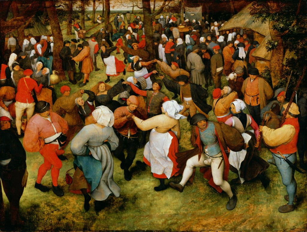
I like to think that the revelers in Bruegel’s wedding scene are dancing to the popular Flemish tune T’andernaken. Originally a folksong, the piece was arranged for instruments by many 15th and 16th century composers including Jacob Obrecht, and Ludwig Senfl, There is even a setting by Henry VIII who somehow found time between marriages and beheadings to compose some admirable music.

I have heard the tune performed several times over the years by the Medieval and Renaissance music group The Folger Consort, usually as an instrumental but twice the sung folksong. In 2012 it was included in the program City of Ladies: The Musical World of 15th Century Burgundy. It was a lovely surprise to hear a song in Flemish, the language that surrounded me in my childhood. Many of the Folger concerts include songs in Latin, French, German, Italian, and Spanish, but it was a special treat to hear Flemish. The moment occurred again this Valentine’s Day in the concert Love Songs of the 15th Century. The program promised two instrumental settings of T’andernaken, the earliest, by Tyting,, and another by Antoine Brunel. But apparently tenor Jason McStoots could not resist the opportunity to sing the folksong and gave us a lively impromptu performance.

From The Folger Consort’s program notes by Consort director Robert Eisenstein:

T’andernacken is a Flemish folksong that became for some reason the basis for some of the earliest, purely instrumental pieces in the 15th-century repertoire… Composers vied with each other in fashioning more and more virtuosic settings of the tune, and it was popular well into the 16th century.  

T’andernaken was first published in The Antwerp Songbook in 1544. As a love song it is far different in tone from the Courtly Love tradition of the period. It is in the folk tradition of songs that tell a story of ordinary people, their heartaches and misadventures in love. It is a cautionary tale that women across the ages can recognize and to me it has a distinctly Flemish sensibility; the hard knocks of life met with earthy humor, unvarnished realism, and determination to enjoy life despite all.

The story is narrated by a man who reports on a conversation he overheard between two young women in the town of Andernach:

Continue reading “A Flemish Folksong”

Beyond Blue and White

The first thing I want to say about this new addition to my bookshelf is that I absolutely adore the cover. I don’t believe in judging a book by its cover, but I do judge book covers. I follow the Best Book Covers of the Year lists and pass my own judgements on the latest design hits and misses. When will the cliche of the “young woman seen from behind” covers be over? The current fashion is for splashes of garish color and odd images designed to shock or defy explanation. In contrast this cover is an inspired fusion of subject and image. The perfect Delft blue color, of course, and the woman-shaped shard of Delftware have an instant visual appeal and tell the story of the book’s contents – the revelation that many of the famous Delft potteries of the 17th and 18th centuries were owned and managed by women.

Genevieve Wheeler Brown is a decorative art advisor who stumbled on this story by chance when she was asked to appraise a large collection of Delftware stored in the New York headquarters of a women’s art organization. When she stepped into the room, untouched for decades, she was amazed to find a superb collection of over seventy-five blue and white Delftware objects, an overwhelming display of beauty and craftsmanship in a myriad shapes and sizes. This treasure, she learned, had been acquired in the Gilded Age when a fashion for collecting Delftware had obsessed wealthy New York socialites. Brown soon became obsessed herself with researching the history of Delftware.

Continue reading “Beyond Blue and White”

The King’s Bedpost

On My Bookshelf I find a favorite history book about a very strange painting…

             Edward VI and the Pope, unknown artist, oil on wood, c1575

At first glance, maybe even a second or third, this is a mess of a painting. It’s busy with awkwardly positioned figures and decorative elements; there’s nowhere for the eye to rest. The viewer’s eye darts about the various unrelated parts trying to make sense of it all. Then there are the blank squares and the puzzling scene in the upper right, a picture within a picture. The artist is obviously trying to say something, but what?

As Margaret Aston explains in The King’s Bedpost it is best to think of it, not as a painting, but as a comic strip or political cartoon. The blank squares were intended to hold text, just like the speech bubbles of today. For unknown reasons they were not all filled in. The book turns that old saying, a picture is worth a thousand words, on its head, for it takes many thousands of words to explain this one. The painting may be no masterpiece but, Aston says, “undistinguished art can make interesting history.

Explaining the painting takes us on a journey through the Old Testament Kings, sixteenth century Dutch art, crucial decades of the English Reformation when much of the medieval heritage of religious art was destroyed by iconoclastic reformers, and even into Elizabeth I’s private chapel. The painting is visual propaganda for the reformers’ view that all religious images and devotional objects were “Popish abominations” akin to pagan idolatry. Once thought to have been painted during the reign of the boy King Edward VI, seen seated in his Chair of State mounted on a dais, Aston shows that it actually reflects the religious conflicts and anxieties of Elizabeth I’s reign. She also details evidence that the source materials for the painting date to the 1570’s. For the unknown artist’s skills were limited, note the unconvincing size and position of the hands, so he copied much of the painting from other works. This dating is confirmed by the modern science of dendrochronological analysis; the wood panel comes from a tree that was cut down between 1574 and 1590.

Aston begins by identifying the people in the painting, recognizable because they are copies of portraits by various artists produced in the 1560’s and 70’s.. She draws our attention to a horizontal line following the base of the king’s dais dividing the painting into upper and lower sections, upper being good and lower bad. Fashion also divides the groups. In the lower section several of the men sport tonsures, the monastic hair style, branding them as Catholics. In the upper section there are no tonsures but copious beards, the style favored by the Protestant reformers.

Continue reading “The King’s Bedpost”

The Plains of Abraham

The Battle of the Plains of Abraham

One autumn afternoon many years ago I stood on the Plains of Abraham high above the St. Lawrence River in Quebec. It remains one of the most memorable scenic views of my life along with the Grand Canyon and the English Lake District seen from the top of Helvellyn. Fierce winds flattened the grass, dark storm clouds threatened above, and the gleaming silver ribbon of the St. Lawrence far below made for a dramatic scene. In fact the sky reminded me of about the only thing I knew at the time about the history of this place, Benjamin West’s famous painting of the death of General James Wolfe. For it was here on the Plains of Abraham in 1759 that a decisive battle was fought in the great struggle for domination of North America. The name conjures a battle scene of Biblical proportions, a recent book on the subject is titled Armageddon, but the bleak windswept plain came by its name in a more prosaic way. The farmer who owned the land was named Abraham.

Continue reading “The Plains of Abraham”